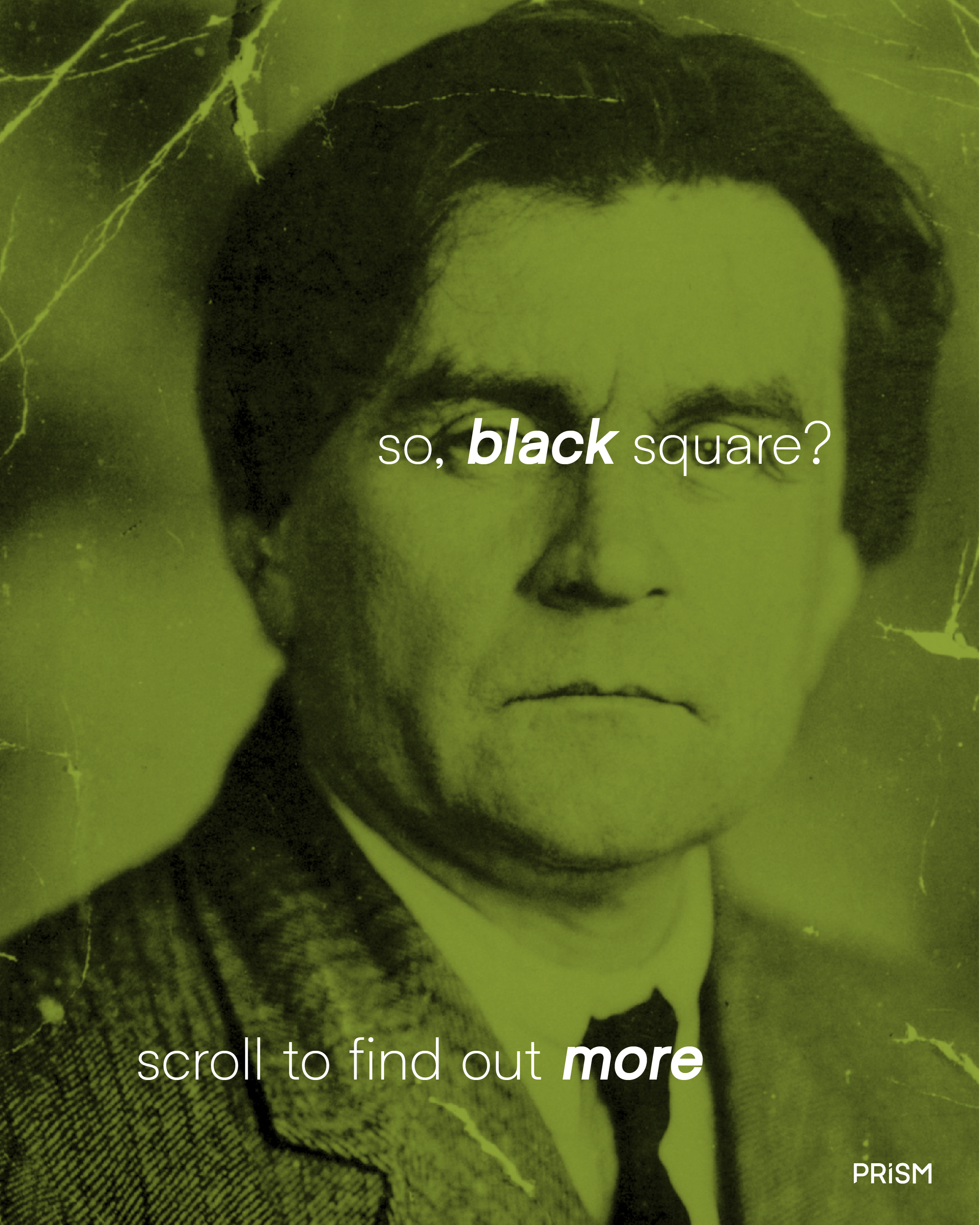
PRISM | Museum Exhibition Branding
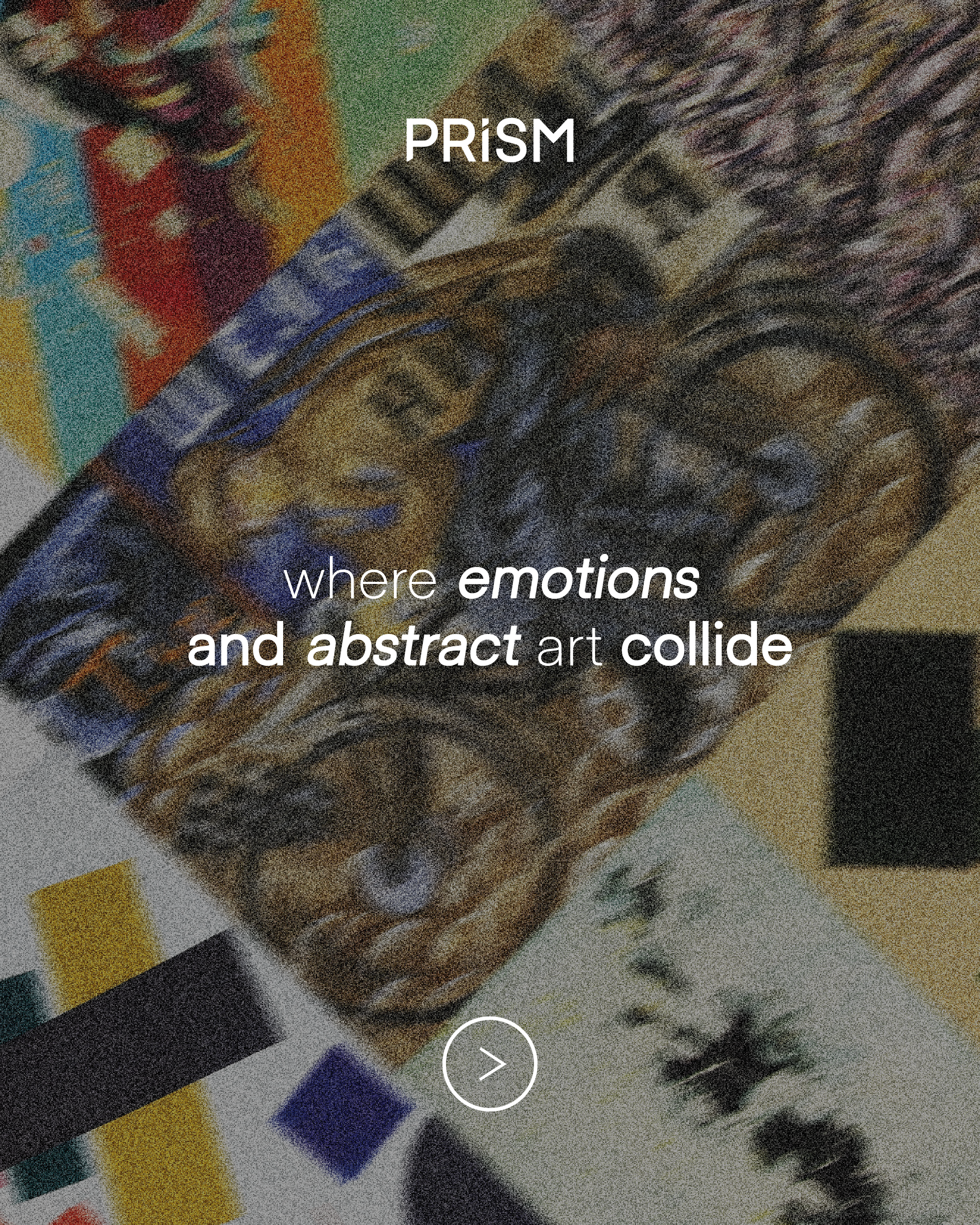
Abstract art and emotion are inseparable, and this idea shaped the entire concept of the project.
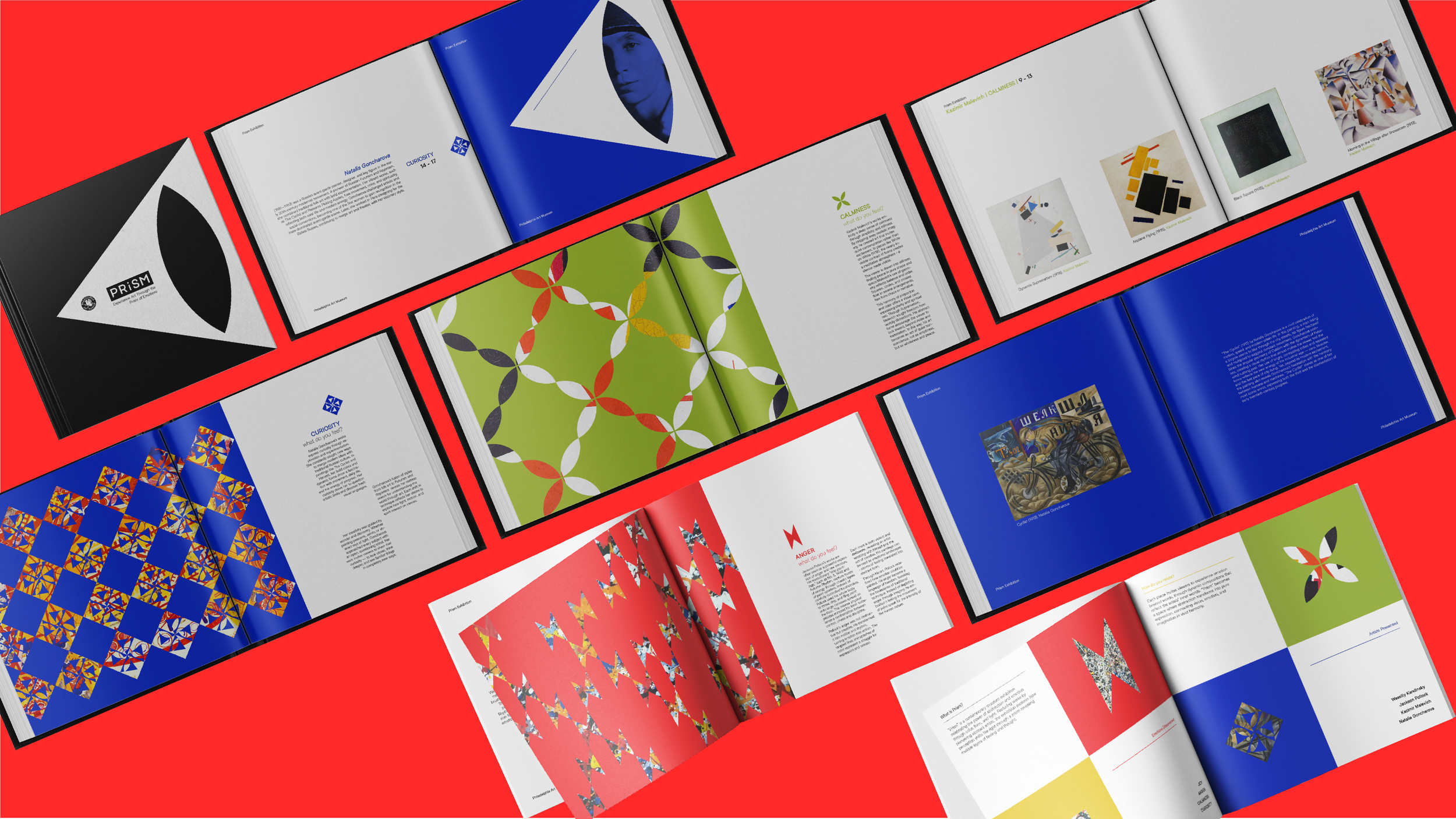
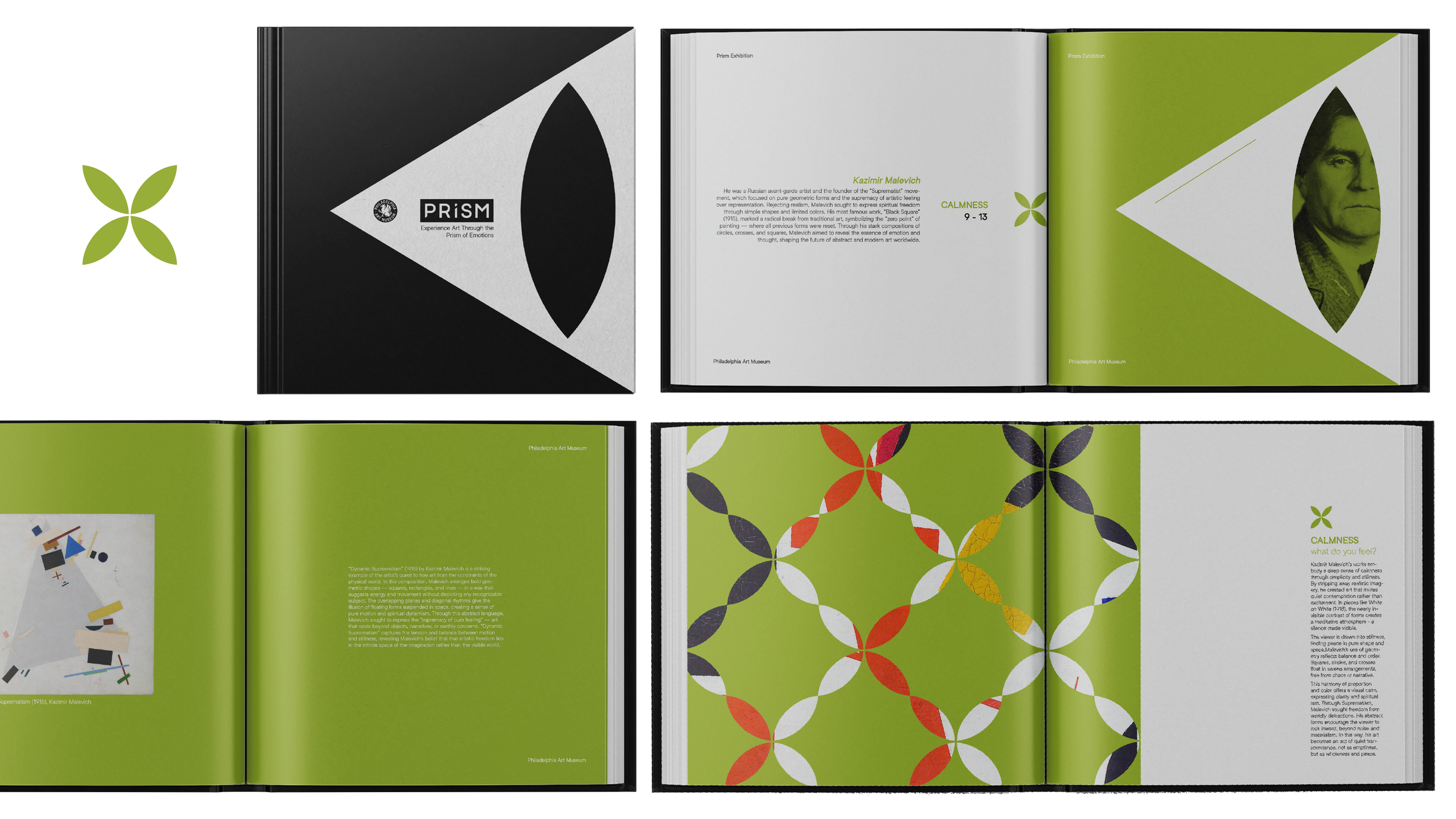
Every viewer experiences a different feeling when looking at an abstract work, just as each artist communicates a personal inner world through shape, color and movement. This is why the exhibition is called PRISM: we see art through the prism of our own eyes, thoughts and emotional filters.
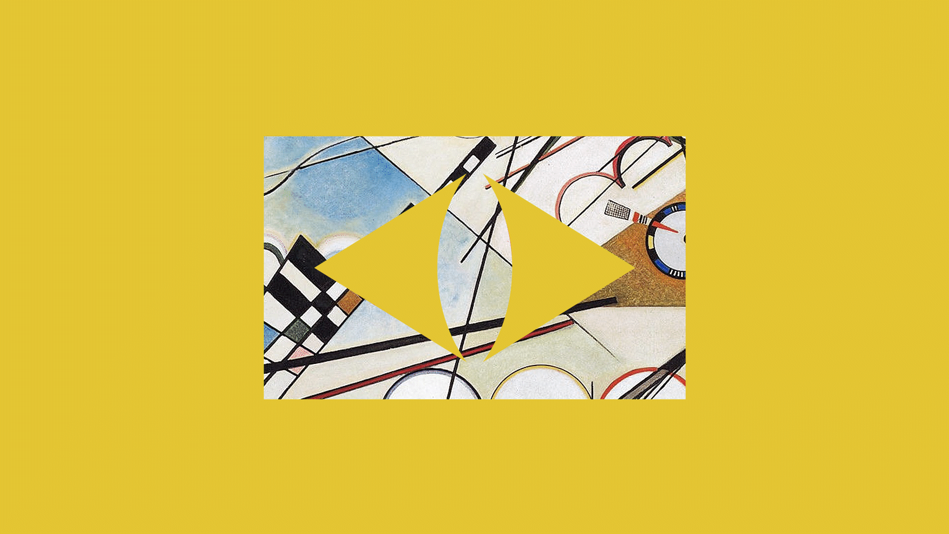
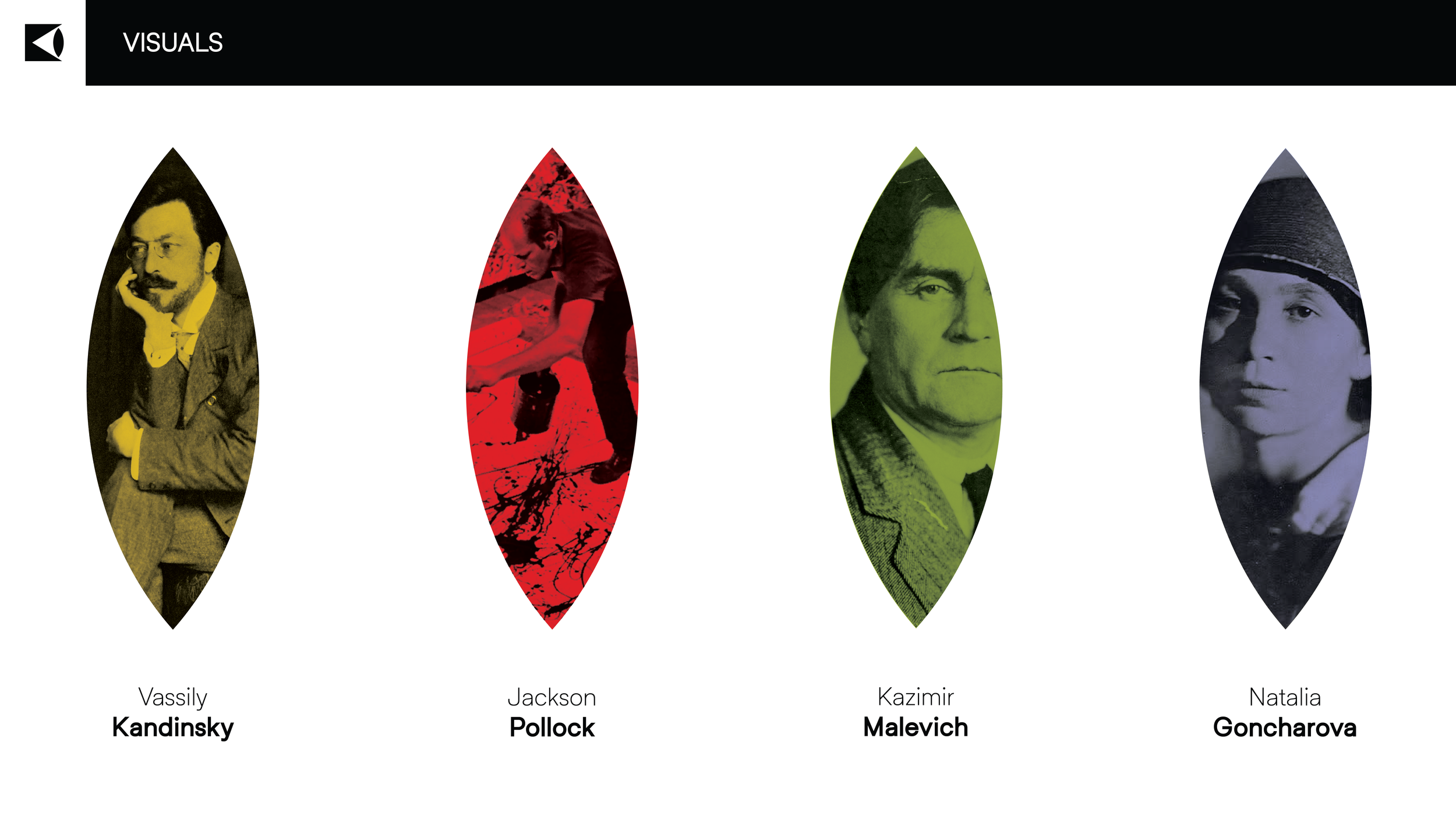
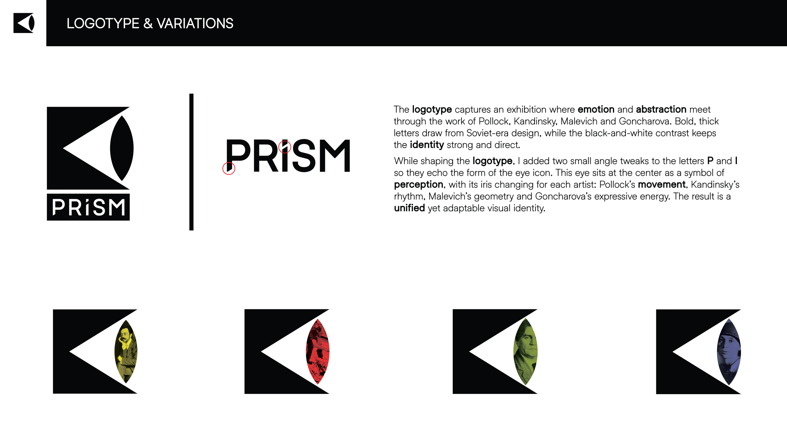
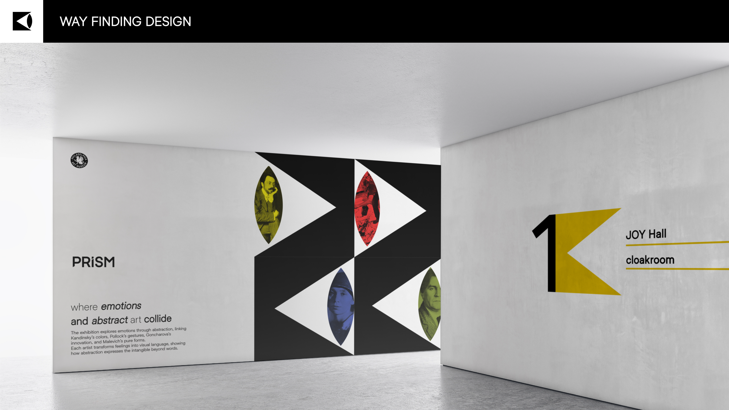
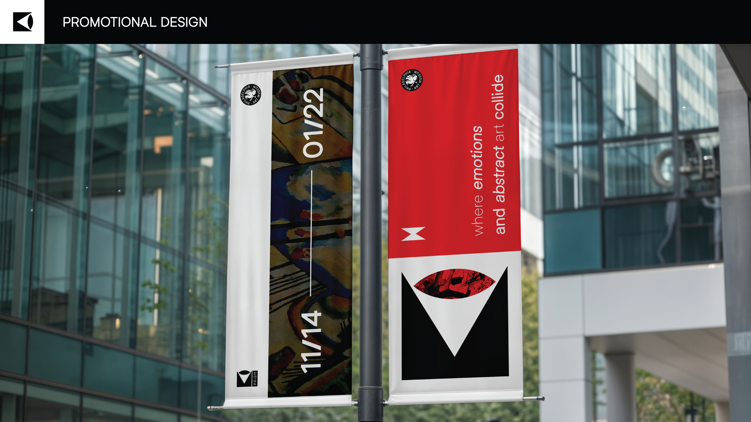
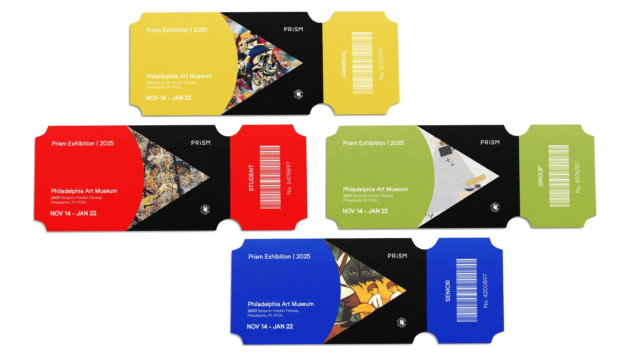
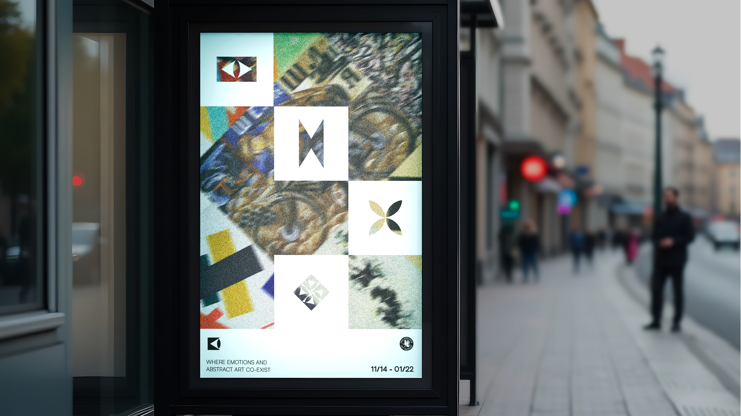
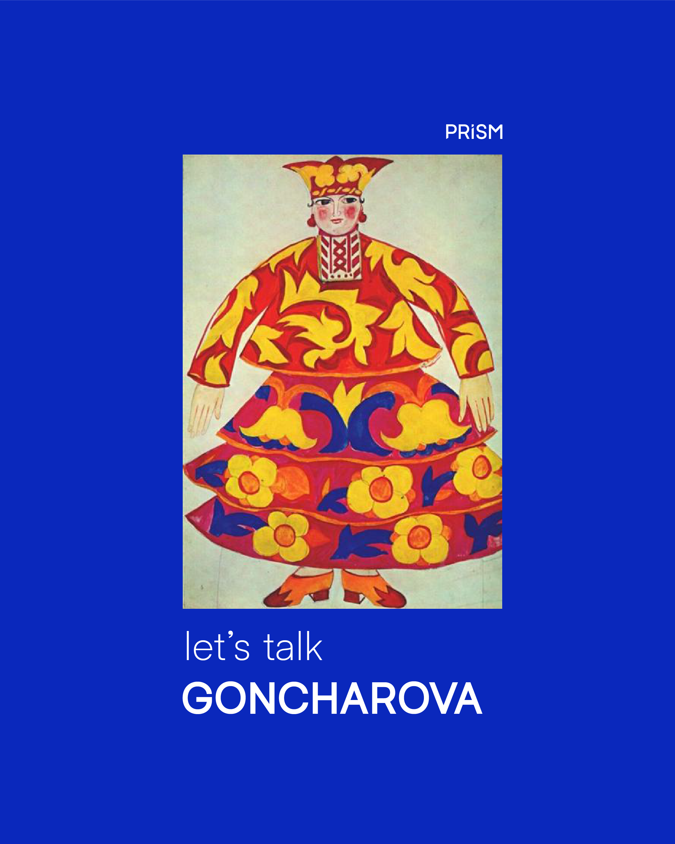
The visual identity reflects this idea through a bold, geometric logotype inspired by Soviet-era aesthetics, paired with an adaptable eye symbol whose iris changes depending on the artist.
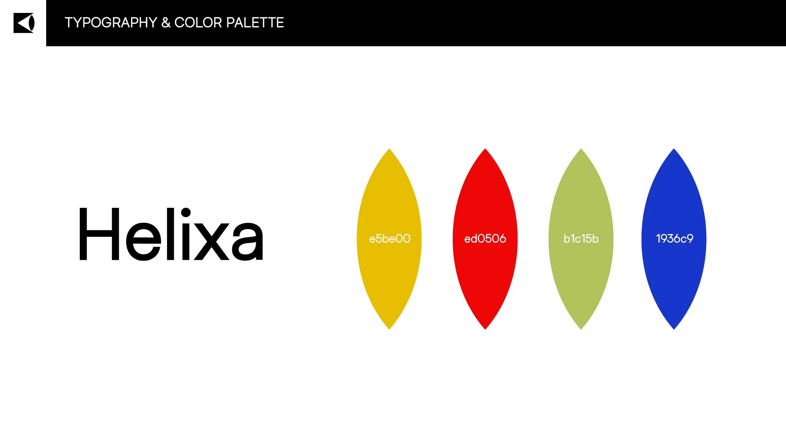
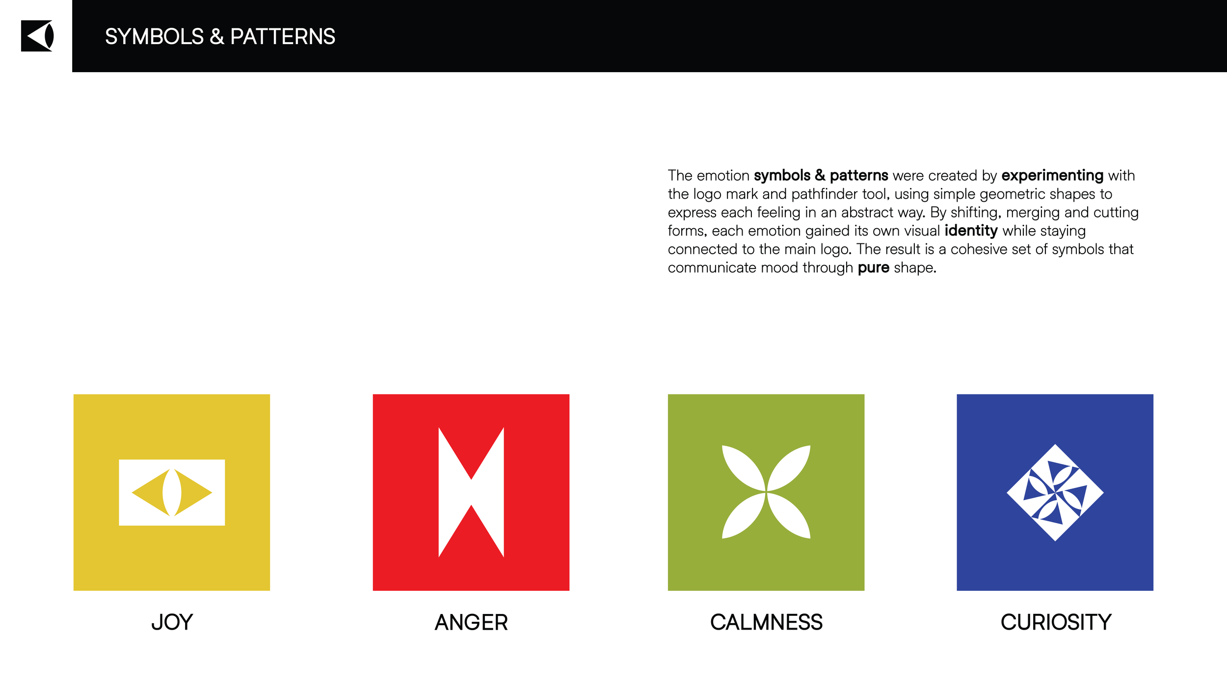
Each emotion is further represented by abstract geometric symbols connected to the logo’s structure. The typography and color palette support this emotional range, creating a cohesive system that mirrors the shifting, multifaceted nature of how we interpret abstract art.